

We design logos that feel right at first glance and still hold up everywhere your brand shows up.
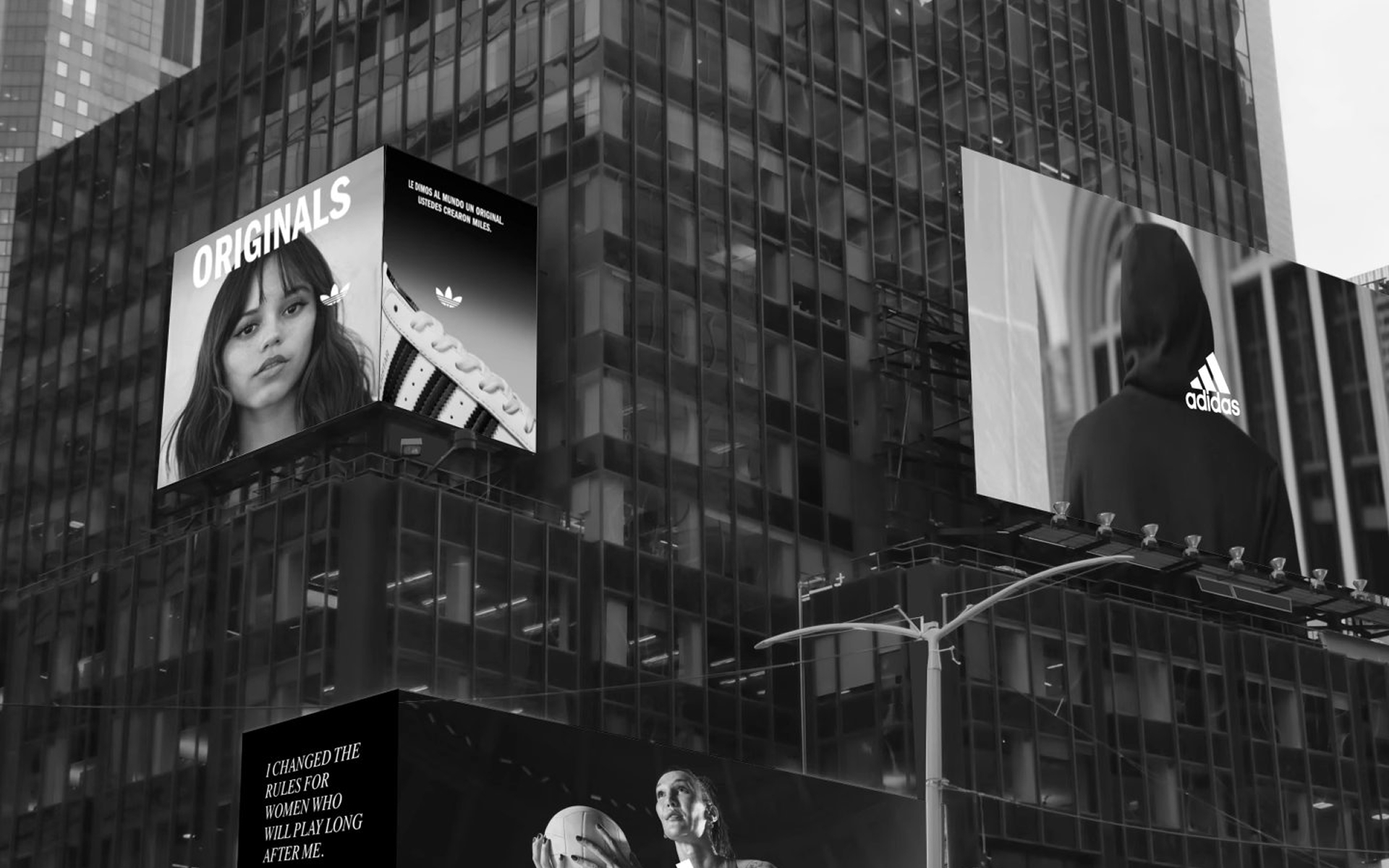
A logo isn't just an icon. It's a handshake. A promise. The first thing people notice and the last thing they remember. We design logos that don't just look good on a mood board; they work everywhere. On a tiny favicon. On a massive billboard. On a merch tag sewn into a hoodie. We don't start in Illustrator. We start with questions. What does your brand stand for? Who are you trying to reach? What's the one feeling you want people to have when they see your mark? Then we sketch. A lot. Dozens of directions, then hundreds of refinements, until the symbol feels inevitable, like it couldn't possibly be anything else. Whether you're a startup looking for a website designer who understands identity or an established brand needing a refresh from a professional website designer, we've got you. The result? A logo that earns its keep.
Logos Designed Across Industries
Years of Branding Experience
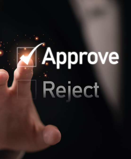
Client Approval on First Concepts
Brand Identity Systems Built
Scalable Vector Deliverables
Flexible logo design services designed to match your workflow, not force you into one.
We design primary logos that represent your brand at a glance, clean, balanced, and easy to recognize. Each mark is built to scale across platforms without losing clarity, whether it’s used digitally or in print, ensuring consistency everywhere your brand appears.
A single logo isn’t enough anymore. We create alternate layouts stacked, horizontal, icon-only, so your identity adapts naturally across websites, packaging, and social platforms. This flexibility keeps your branding consistent without forcing awkward adjustments later
Typography plays a bigger role than most people expect. We either customize or carefully select typefaces that match your brand’s tone, modern, classic, bold, or minimal. One subtle shift in lettering can completely change how a logo is perceived.
We build color palettes that support recognition and usability. It’s not just about choosing colors, it’s about how they interact across backgrounds, screens, and print materials. The goal is a palette that feels consistent no matter where it’s applied.
Once your logo is complete, we document how to use it properly, spacing, sizing, colors, and placement. These guidelines help maintain consistency as your brand grows, especially when multiple teams or designers are involved.
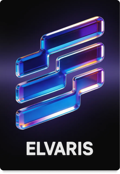
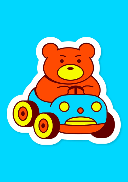
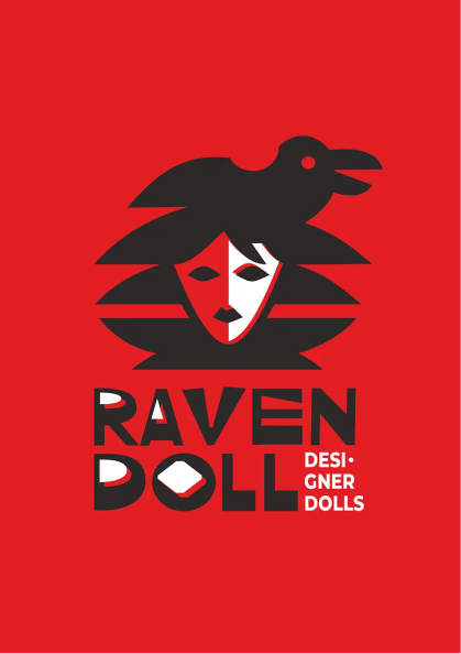
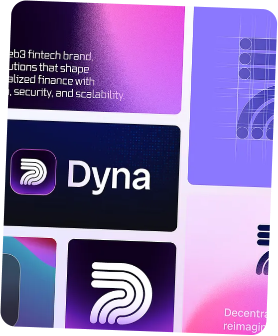
An organized look at logos designed for clarity, versatility, and long-term brand recognition.
A few brands that trusted us to point them in the right direction.

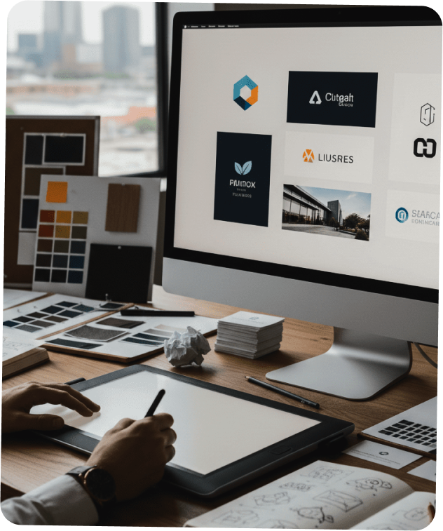
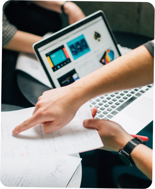
Every logo starts with context. We learn about your business, audience, and positioning before sketching anything. This step helps us avoid surface-level ideas and focus on concepts that reflect your brand’s personality and purpose.

We explore multiple creative directions, each built around a clear idea. These aren’t random designs; they’re intentional concepts shaped by research and brand insight. This stage lets you explore different visual approaches before narrowing down the strongest direction.
Once a direction is selected, we refine every detail, spacing, proportions, typography, and color. Small adjustments here make a big difference in how the logo feels and functions. The goal is a mark that looks effortless but holds up under close inspection.
After final approval, we deliver your logo in multiple formats: vector, web-ready, and print-ready files. We also provide usage guidelines to ensure your logo remains consistent across platforms, helping your brand maintain a strong, recognizable presence over time.
 Daniel Carter — Startup Founder
“The logo Webneons created feels simple but incredibly strong. It’s easy to recognize, and it works perfectly across our website, packaging, and social media.”
Olivia Ramirez — Marketing Manager
“They took our scattered ideas and turned them into a clean, professional logo. The process felt thoughtful, and every design choice actually made sense.”
Jason Bennett — Business Owner
“Our previous logo looked outdated. Webneons redesigned it into something modern and scalable, and customers immediately noticed the difference.”
Sarah Mitchell — Brand Manager
“The new logo fits our brand perfectly. It’s versatile, easy to use, and looks just as strong on small screens as it does in print.”
